MOORA
SOCIAL MEDIA/ ADS / WEBBANNERS


ELEVATE YOUR DRESS
It's Time to Glow
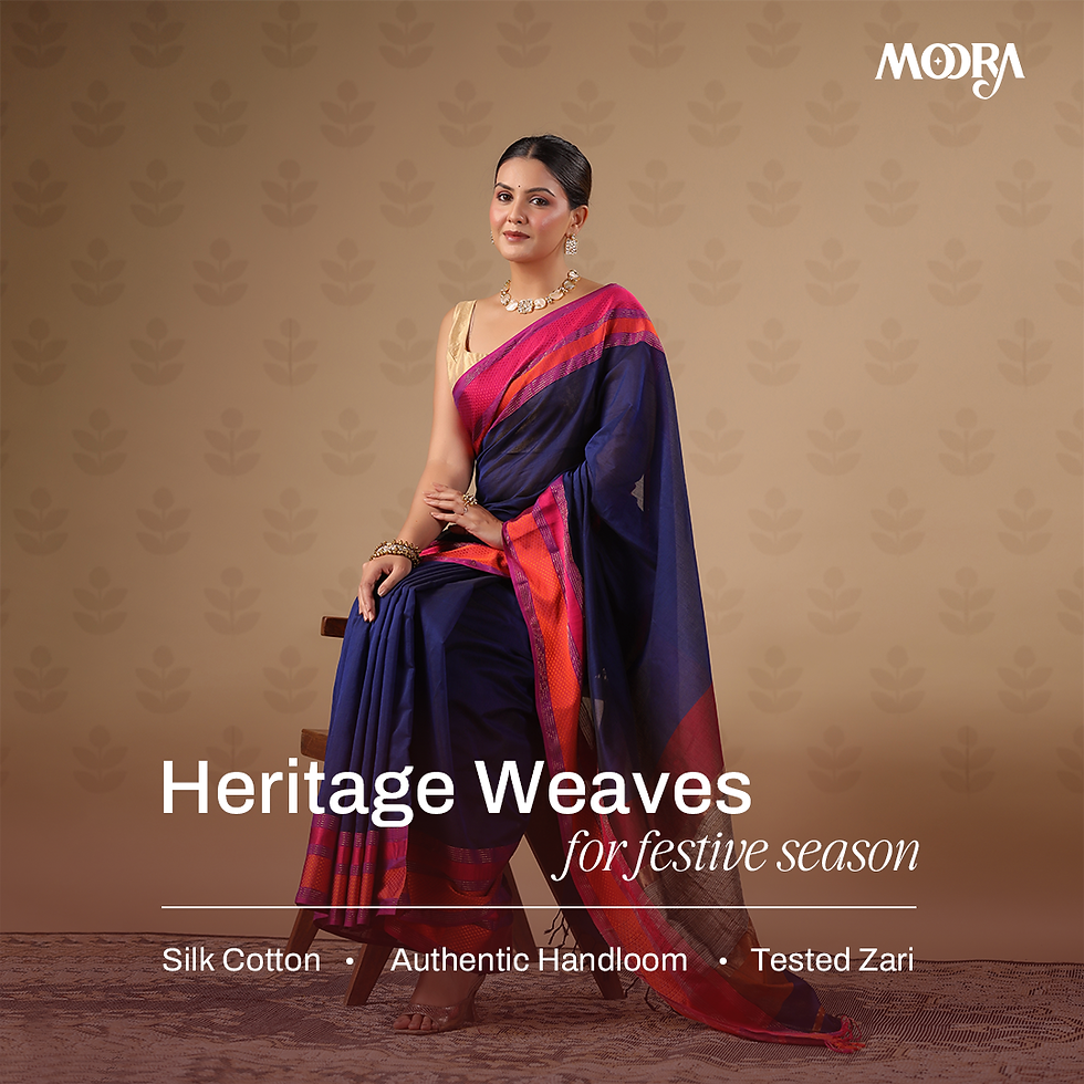
Moora is all about embracing a carefree, playful spirit. Their sarees are handcrafted by rural artisans across India, using traditional techniques like hand block printing on fabrics such as mulmul cotton and chanderi silk. The designs often blend heritage with modern aesthetics, making them perfect for both everyday wear and special occasions.


.png)
.png)
.png)


Their philosophy is rooted in authenticity, inclusivity, and making sarees accessible for everyday wear—especially through innovations like pre-draped “1-minute” sarees and sarees with pockets.
They’ve got everything from ombré organza to bold Bagru prints, and even pre-stitched sarees with pockets (yes, pockets!). The brand’s philosophy celebrates being raw, uninhibited, and young at heart.
ABOUT
Moora is a Jaipur based artisan made saree brand with over 41,000 followers on Instagram. I had been working with them for almost 1 YEAR designing their social media creatives, Instagram reels, Meta Ads and Stories, and their website banners for the upcoming collections.

EXPERIENCE
Working on a artisan made saree brand was a fun experience as I gave me a great opportunity to understand the Indian saree market, choices of people, working on different collections, different styles, Exploring something new was indeed a great experience.


I had the privilege of contributing to Moora’s festive and premium packaging collateral, including their box design, folding paper inserts, and customer badges. My role began with selecting the color palette for the box, narrowing down options between red, green, and blue. We ultimately chose a deep green accented with gold, evoking a sense of elegance and celebration.
For the illustration, the objective was to convey themes of freedom, flexibility, independence, and minimalism. I created an artwork that visually captured these values while aligning with Moora’s aesthetic language.
Typography selection involved a few initial rounds of deliberation, after which we finalized a clean, serif typeface. This was paired with the Moora logo and their iconic star motif on the side panels to reinforce brand identity with subtle sophistication.


